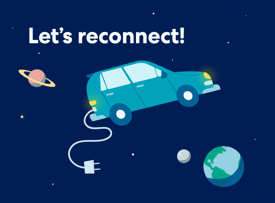
Service design for the Pulse device signal loss flows
Overview
Role
Team
Platforms
Dates
sole product/service designer, content designer
pm, data scientist, 3 BE engineers, 2 FE engineers, animator, creative director
web, sms, push, email
March 2019 - May 2019
Background
Metromile is a pay-per-mile car insurance company–instead of paying a flat-rate premium, customers pay a variable premium each month based on how much they drive:
base rate + per-mile rate (number of miles driven) = monthly premium
You might be wondering how we know the number of miles each customer drives per month; that’s where the Pulse device comes in. The Pulse device is a small, cube-like device that plugs into the car. It collects all sorts of driving data, including time stamps and gps coordinates, which our engineering team uses to calculate the number of miles a user drives on any given day.
Understanding the problem
The status quo
Most of the time, the Pulse device does its job correctly–it counts the miles users drive. Metromile then correctly charges users for those miles, hopefully saving them money compared to traditional insurance. However, the Pulse device connectivity was and is today, imperfect. A device could lose signal under many scenarios such as:
An electric vehicle turning off
A car parking or driving in an area without a signal (e.g. in an underground parking lot, an area without service, etc.)
A car in the shop having its device removed
A user purposefully unplugging their device
When Metromile first launched, we didn’t have a way to differentiate between all of these different situations. If we lost signal from a user’s Pulse device, Metromile was assuming the worst of our users and treating them as if they’d intentionally unplugged their device. We sent out harshly worded emails and quickly started charging them Penalty miles. This was the original service design for users whose device lost signal:
Penalty charges, otherwise known as Penalty Miles are a flat-rate, daily charge of 250 miles. The average Metromile customer drives about 6k miles a year or about 16 miles a day, so though a 250-mile daily charge really motivated users to make sure their device was connected, it also felt like a harsh penalty. Prior to this project, this was the experience all users who lost their device signal would experience.
Problems with the status quo
There were two main challenges with the solution as it was designed:
“Your device is defective and you’re threatening to charge me 250 miles a day until I fix your defective device. I don’t have time for that”
- Customer from New Customer NPS Survey
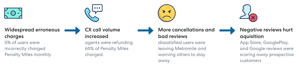
Users who did not intentionally unplug their Pulse device and who were not getting “free” miles were getting threatening emails. Often, their Pulse device was losing signal because they weren’t driving their car regularly, and many of these same people were getting notifications over and over again. Essentially, Metromile was driving away our best customers with frustrating, stressful emails that required their attention and a call to customer support.
Users who were purposefully and fraudulently unplugging their Pulse device could drive “free” for 11 days before Penalty miles kicked in. They could easily replug their device before getting their first 250-mile charge and then unplug their device again when they had a big trip.
Essentially, we were punishing our best customers and doing nothing to actually deter our worst. Our system wasn’t effective or fair. Philosophically, Metromile needed to re-evaluate our approach to this issue.
The scale of these problems was large. In 2019, about 8% of users were charged Penalty Miles every month. Of those users, about 65% were incorrectly charged for at least one day. Crunching the numbers, 5% of our customers were wrongly charged for Penalty Miles each month! This was impacting the business on every level.
NPS analysis to better understand user pain points
Next, I worked with our user researcher to analyze historic device related NPS comments to understand their pain points and inform our design decisions. We went through the comments and distilled four key themes:
Frustrating when users miss the emails and rack up charges
“You didn’t even tell me I wasn’t connected and then just charged me.”
Frustrating when users get notified, because they’re not driving
“Stop requiring customers to call in when a vehicle is inactive. The entire point of Metromile is for people who don’t drive that often. I’ve been a customer for two years. Two years of driving history. You know that I rarely drive any of my vehicles.”
The tone of our communications feels threatening
“Your device is defective and you’re threatening to charge me 250 miles a day until I fix your defective device. I don’t have time for that.”
When we overcharge users, we lose their trust
“You botched my mileage refund and now I have to go clean it up. Honestly, I'm going to be an active detractor of your company now.”
Envisioning the solution
The goal
Make Pulse device installation and ownership a delightful experience by reducing the number of customers receiving incorrect charges and speeding up the time to replug for users who unplugged their device.
The how: the Unplug Model
When the Pulse device software was updated to provide new accelerometer and gyroscope data, our team had an opportunity to fix this broken user experience. Our data science team used these new insights to build a model that produced an unplug score, which represented the degree of certainty that the Pulse device was purposefully removed.
The data science Unplug Model (shown below) takes different user scenarios and assigns to them probabilities that the signal loss was intentional.
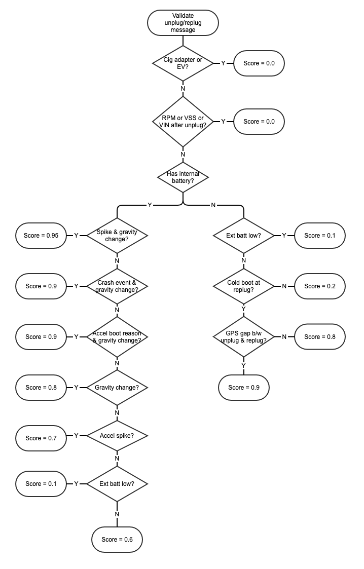
For example, if a user drives an electric vehicle the model returns a score of zero; we can’t determine whether they unplugged their device or not, so we’re assuming innocence.
If the user parks or drives in an area without a signal and the device has an internal battery, there will be no accelerometer data returned and the model will return a score of 0.6.
If a car is in the shop and the device is unplugged by a mechanic, the model would likely return anything from a 0.95 to a 0.7.
If a user purposefully unplugged their device, regardless of motive, the same scores would return as the mechanic unplug. (Maybe if they were really angry when unplugging they’d return a higher score!)
For pulse devices with no internal batteries, the model doesn’t return an unplug score until after the device is reconnected to the car, so we couldn’t determine an unplug probability until after their signal loss was resolved.
In the end, we decided any score above 0.7 at the time of signal loss would be coded as a purposeful unplug.
Translating the model into experiences
With the buy-in from the team and informed by the user research, I established guiding design principles for the project:
Assume best intention There are times when Metromile doesn’t have the data to know what a user did. In those instances, give users the benefit of the doubt.
When interacting with the experience, users should never feel like we’re pointing the finger.Be as quiet as possible Users don’t want to have to think about their car insurance, especially people who drive infrequently, but when necessary make sure our users get the info they need.
Don’t over burden our users.Proactively provide support Handling the pulse device can be confusing.
Give people the relevant resources to feel empowered.
I knew there were going to be many possible solutions and wanted to make sure we didn’t fall into the same pitfalls as the last design.
I worked with the PM, data science, and the engineering team to determine the different user scenarios and map the data outputs to user groups. This way, I understood how our system would or wouldn’t be able to differentiate between the various user scenarios. I also wanted to minimize the number of flows needed to reduce the engineering work and service complexity, but also make sure the flows were user-centric. My main questions were:
What are all of the possible scenarios where a device could lose signal?
What is the ideal service experience for each of these scenarios?
Given the data we’re getting back from the unplug service, which scenarios look the same quantitatively even if they’re qualitatively different?
Where is there a quantitative difference but qualitative overlap in the ideal service experiences?
In this experience map, each user intention has its own column while the color coding represents our system’s ability to differentiate between scenarios, e.g. all user experiences coding in red are ones where we know a user has unplugged their device at the time of signal loss.
As I created this, one of the complicating factors was whether Metromile had sent the user a battery-powered device (with its own internal power source, enabling it to send a signal to Metromile even when the user’s car is off) or a non-battery device (without its own power source and the capability to sending a signal to Metromile when the user’s car is off.) In practice, Metromile was able to get real-time data from battery devices, but only get data from non-battery devices once the device was reconnected to the user’s car. Whether a user was sent a battery or non-battery device was completely random.
The Unplug Model reduced but did not eliminate the probability of mistakenly charging penalty miles. Therefore we had to craft a communications strategy that accounted for the lingering uncertainty. The key was creating a service design and crafting communications that addressed the worst-case user actions while not alienating users who had done nothing wrong. The team was onboard.
I then broke the flows out further, creating a rough, but more detailed comms flow chart detailing various communication options. This went through two iterations. Between each iteration, we collaborated with our cross-functional team to hone in on the design that would meet our user and business needs as well as adhere to our technical limitations:
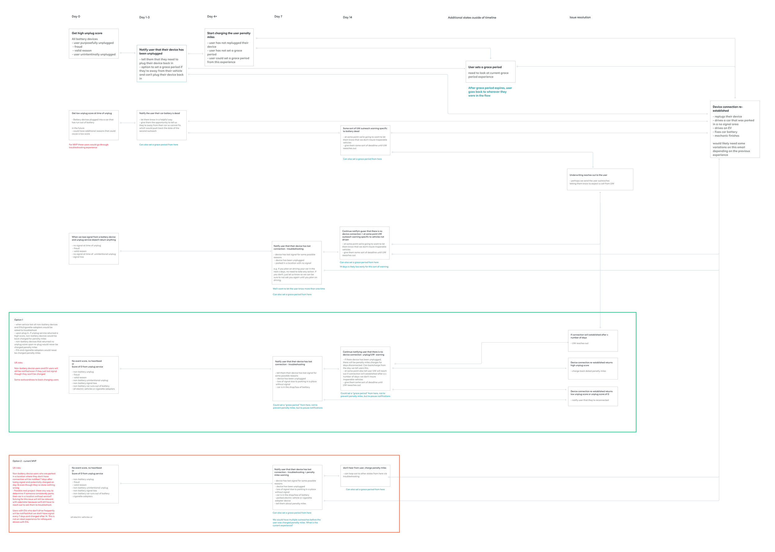
The first iteration of the flow. In this version I'm exploring two options for devices with no Unplug Score (the blue columns in the user journey map). In option 1, we refer the user to Underwriting while in option 2, they get No Signal charges. (Click to view in more detail)
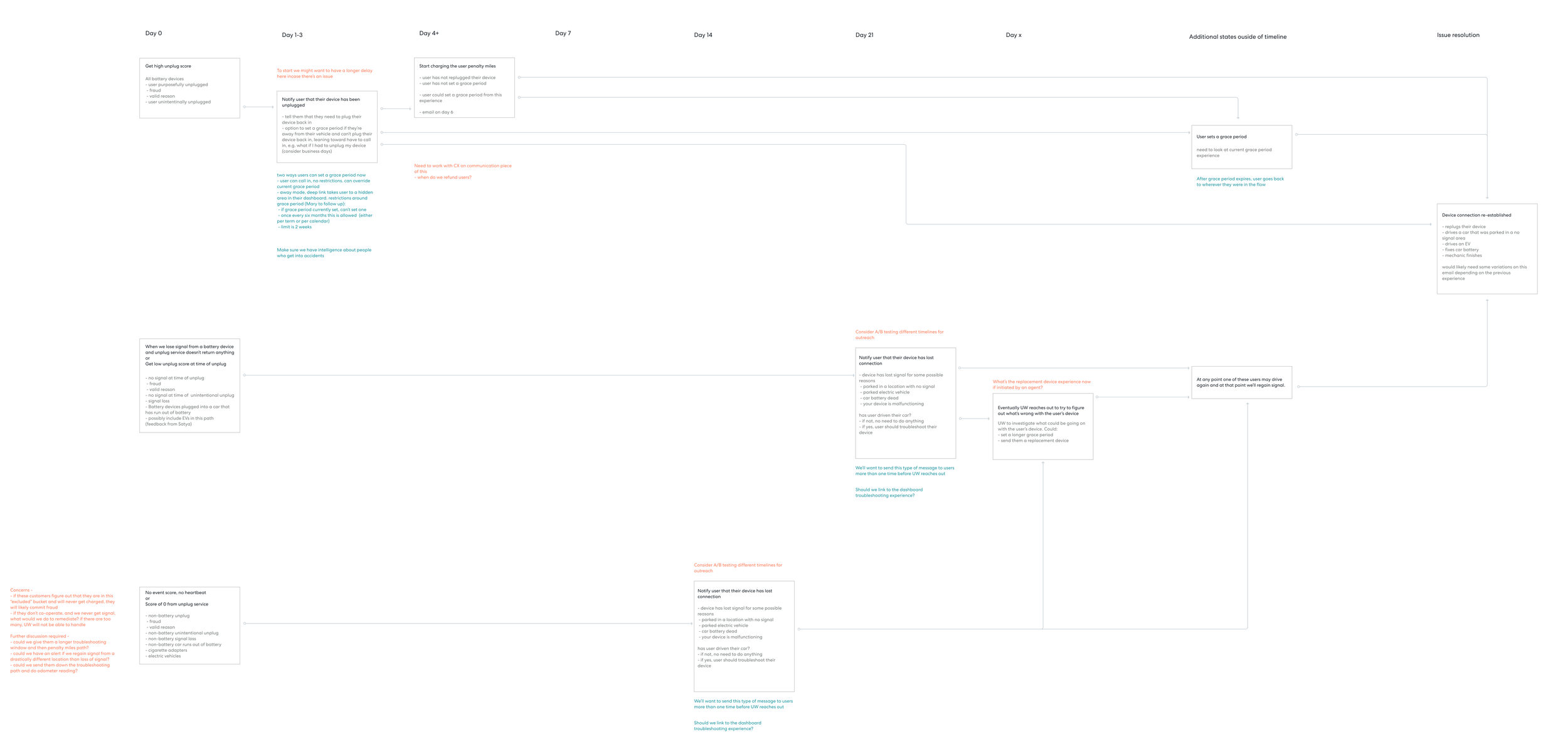
We felt option 1 was more aligned with our design principle. After consulting with legal and engineering, we also realized back charging No Signal charges was not an option, so had to revise our strategy. Additionally, we realized the service experience in two of the four flows could be consolidated into one flow. (Click to view in more detail)
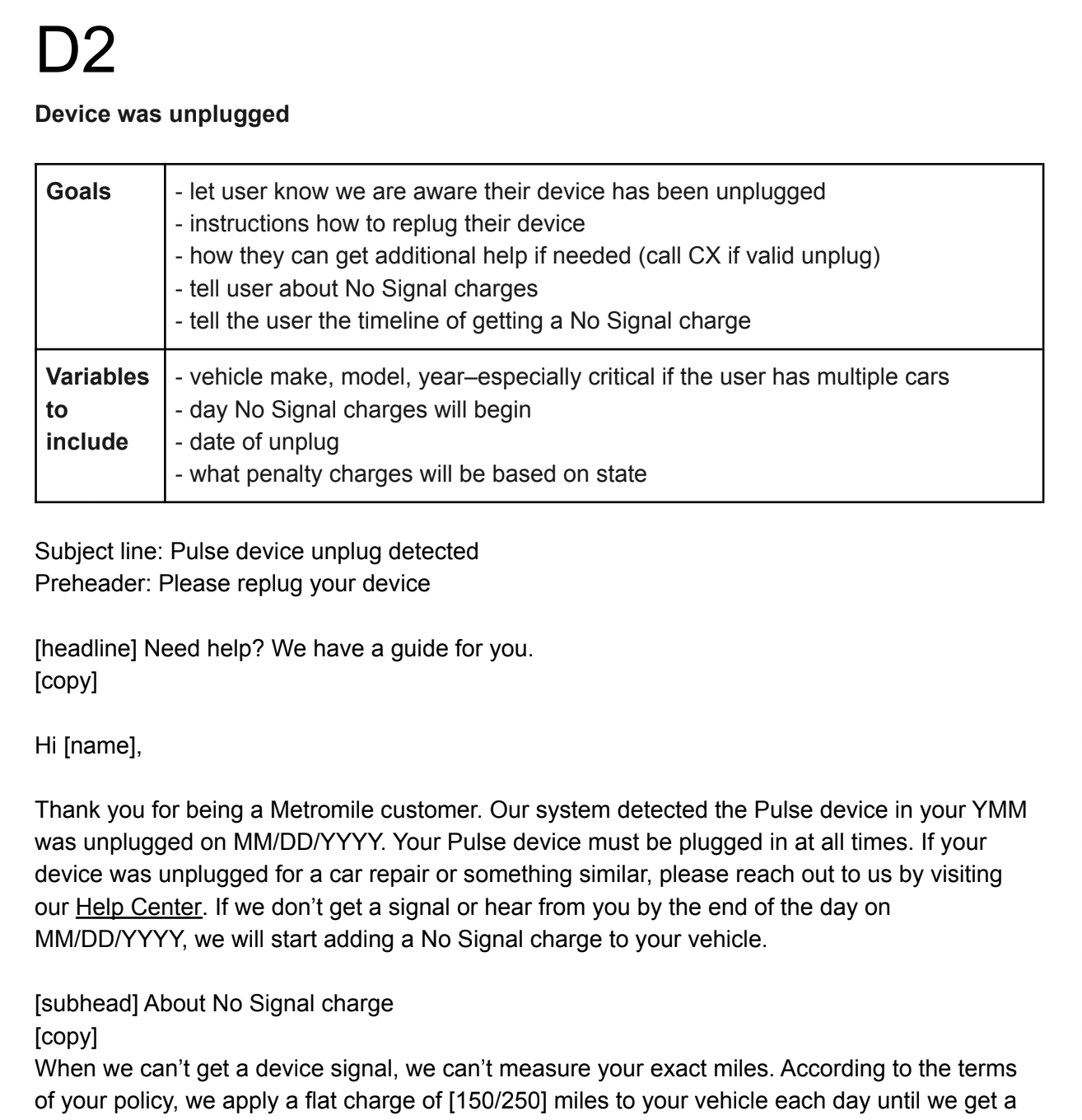
After agreeing on which user scenarios would share an experience flow and nailing down the general timeline, I broke the flows out even further, detailing the communication timelines, user and system decision points, and communication strategy. For each step, I wrote out the goals (i.e. what we needed the user to know), assumptions, variables to include (e.g. vehicle make, model, and year), and tone guidelines.
(Click image to view in more detail)
Throughout this process, I continued meeting cross-functionally. As new information came to light, the flows changed significantly:
we decided not to allow users who got a high unplug score to set their own grace period, (i.e. a period of time where their device is not required to send a signal) through their online Metromile portal. We didn’t want to make it too easy for users who had purposefully unplugged. However, users could still contact our customer experience team directly if they had unplugged for a valid reason. At this point, our customer experience team could listen to the user’s story, look at their device history, and then use their discretion to decide whether the grace period was warranted.
in collaboration with the underwriting team, we also added in additional reporting to identify users whose devices initially returned no unplug score but then when signal was regained, returned a high unplug score.
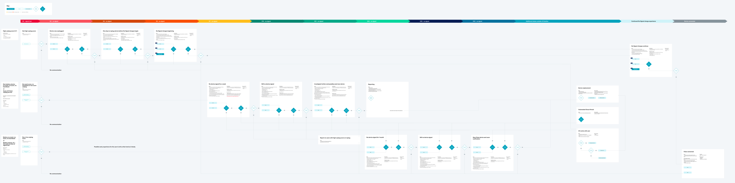
Here a zoomed in view of the beginning of the flow for users who get a high unplug score shows the various backend decision points, user communications, and user decision points. Each user communication maps to a unique email or sms, which can be read in full in the communications documents linked below.
I talked this flow through with my cross-functional partners: product, engineering, customer experience, and underwriting. Getting input early and often from all stakeholders was critical to the process and prevented the need for eleventh-hour critical changes. As changes to the flow were made, I would update the asset so we wouldn’t lose any essential details as we moved into the next phase where we actually wrote the communications. This asset was also the roadmap our engineering team used to build out the flow, so it was essential it served as a source of truth.
Collaborating with creative
Our updated brand guidelines.
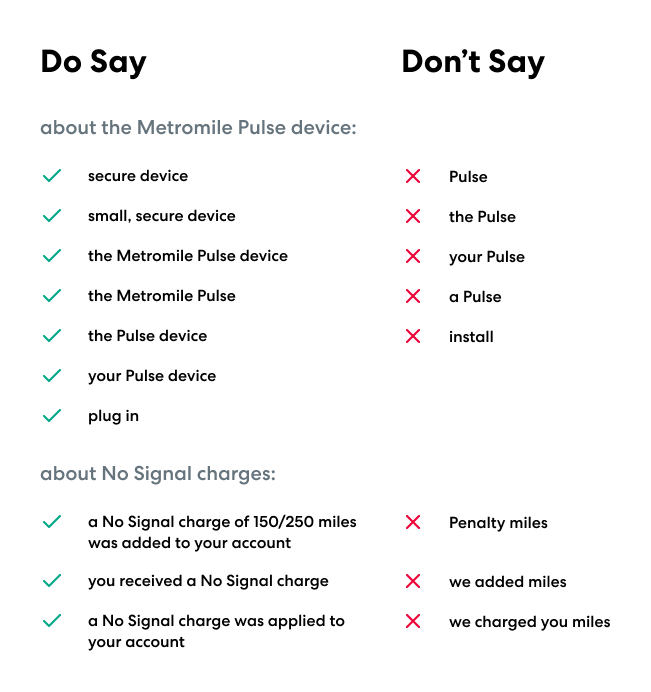
When reviewing user NPS comments, I saw an opportunity to improve some of our terminology around our Pulse device. Specifically, users often didn’t know what the Pulse device was, felt daunted by the term “install,” and didn’t understand why they were getting “Penalty Miles.” In contrast, telling a user to “plug in” their device felt like an easier task, and the term “No Signal charges” is both more descriptive and feels less punitive. Through presenting this evidence, I persuaded the Creative Director to rethink our use of language. With the support of her team, we established new brand guidelines that cascaded through all of our communications.
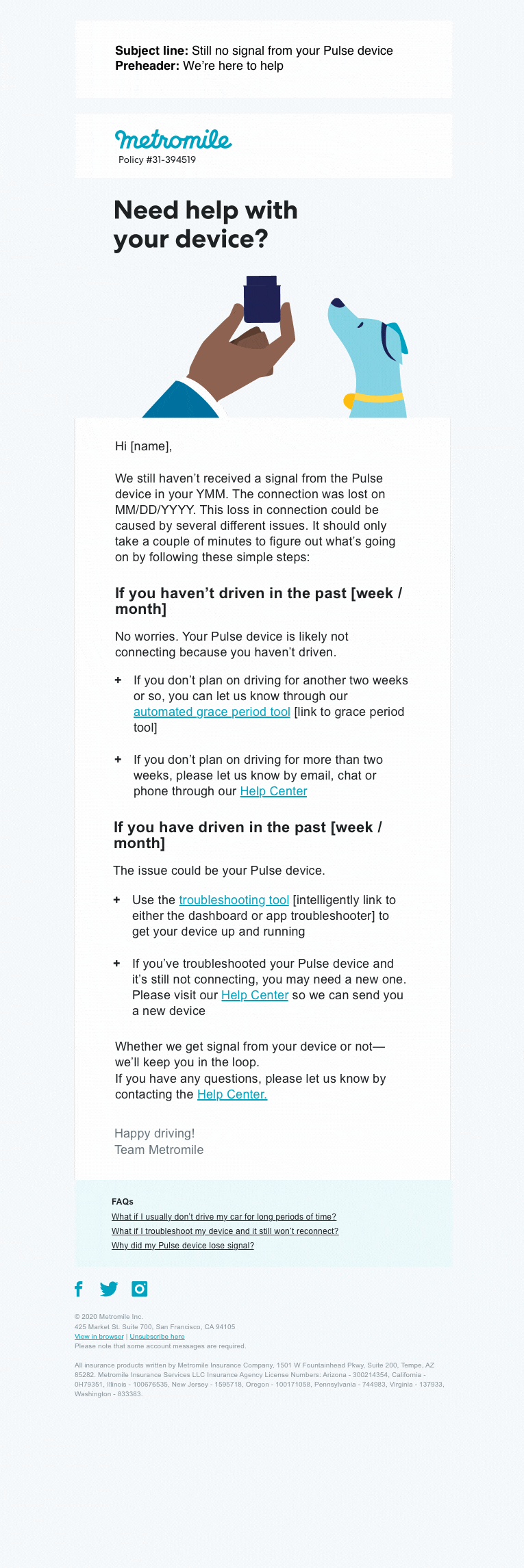
Additionally, as I was writing the comms, I worked with our (incredibly talented) animator to concept animations for the emails. We faced two big challenges with emails: convincing people it was worth their time to read them and reducing the frustration a user feels when receiving an email telling them their car insurance needs their attention. By including playful animations in the comms, we hoped to make emails more interesting and more positive feeling.
Writing the comms
It all started with a couple of giant Google Docs. I translated the skeleton of the flow into the doc, took an initial pass on all of the comms, and then our cross-functional team swarmed on the comms pointing out missing information, helping to finesse the messaging, and eventually perfecting the copy:
To make sure we were proactively answering user’s questions, I worked with our communications team to update our Help Center with new FAQs relevant to the updated flow:
The spreadsheet I created to track our new FAQs for dev handoff
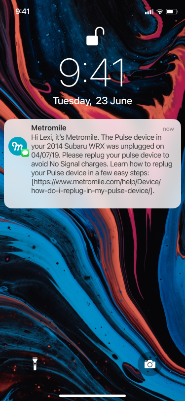
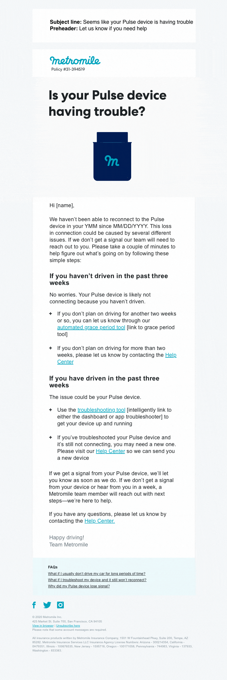
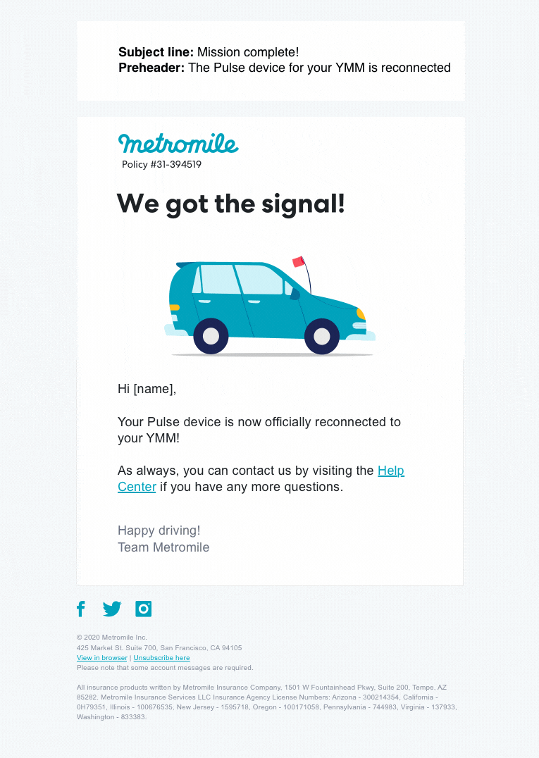
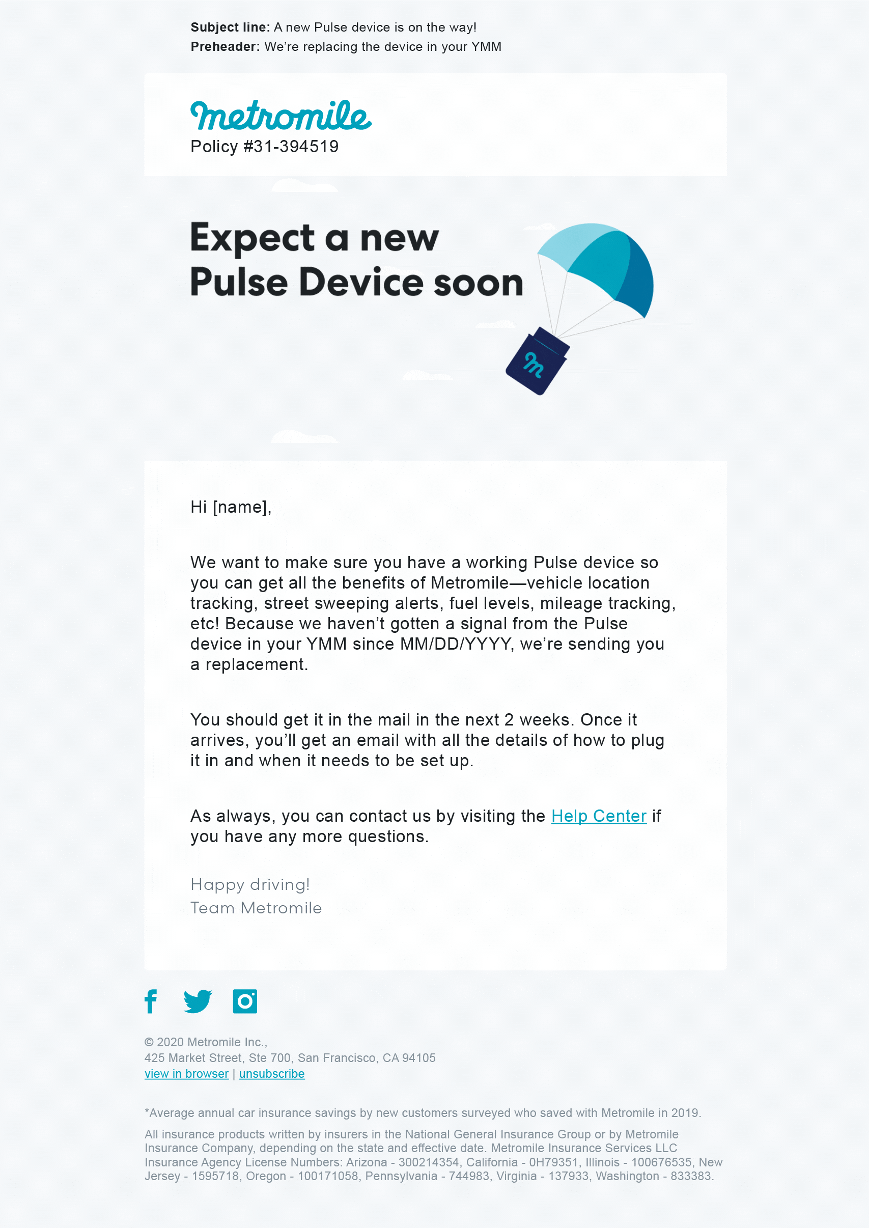
With the help of the marketing team, the final draft emails were then moved into a recently revamped Iterable template. Shown below is an assortment of the communications we created:
Outcomes
What changed?
Through this project, we changed how and when we notified users, who we reached out to, and the way we spoke to them. This resulted in massive positive outcomes:
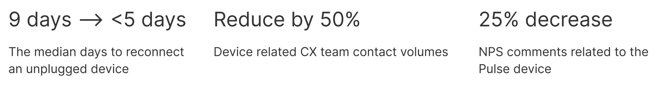
The median days to reconnect an unplugged device went from 9 to 3
Customer experience team contact volumes went from an average of 15k per month to about 4k per month
NPS comments related to No Signal charges (formerly known as Penalty Miles) dropped by 30%
Future steps
We created such a strong comms strategy and built the flows in a flexible enough way that we were able to repurpose this service design for all of our device onboarding and device replacement flows, saving us an immense amount of time, improving the user experience across all device experiences, and improving device adoption. This greatly decreased negative customer experiences with the device and increased the premium we collected.
In the long term, I believe building out more robust in-product features around device status would greatly improve the experience. Buried within the Metromile app we have a place where users can check the connectivity of their device. That said, this feature is not easily accessible nor is the information reliable. Because the device is so central to the Metromile user experience, putting this status more front and center within the app and user web dashboard would both reduce user stress around the device, help Metromile more easily communicate necessary device actions, and provide an accessible jumping-off point within the UX for the user to take action on their device.