Creating a sense of progress
sole product designer
pm, backend dev, 2 mobile devs, content designer, visual designer, clinical innovations manager
iOS
March 2018 - June 2018
Role
Team
Platforms
Dates
Background
Lantern is an app-based Cognitive Behavioral Therapy (CBT) program. Lantern’s CBT programs were developed and tested by researchers at Stanford University and proven to be clinically effective in the treatment of disordered eating, anxiety, and depression.
The Lantern programs all have interactive CBT tools and online coaching. With the guidance of their coach, users progress through the program at their own pace.
The original homepage design had a finite number of daily sessions in a pre-determined order.
Our original homepage design with a linear program and finite number of sessions.
The Team had recently re-designed the homepage to allow us to delivered content in a more dynamic way.
Understanding the problem
Our dynamic program with updating content in a recommended, but flexible order.
The status quo
The new design allowed our coaching team to build a dynamic content plan for each user, depending on their clinical needs. Users could also choose to do the content in their plan out-of-order, depending on their in-the-moment needs.
Problems with the status quo
Since releasing our new homepage, users weren't coming back to Lantern after their first session with as much frequency. By session 3, in the previous linear homepage experience around 60% of users came back for a 3rd session. In this new design, only about 50% came back for a 3rd session.
Based on user feedback, we hypothesized the major drawback of this new homepage was that users no longer had a sense of how long their plan was and thus, how far they had progressed through their Lantern treatment. Without this sense of progress, users lost motivation and stopped engaging with their program.
Defining the project
User goals
Using feedback gathered from several rounds of user interviews, the PM and I collaborated to define user goals.
As a user, I feel motivated to come back to use Lantern a second time because:
I understand the step I will need to take in my Lantern journey–I know that there is a direction I'm heading and how I will get there.
I feel confident that Lantern will successfully help me take these steps–I trust Lantern as a clinical authority.
I feel rewarded for the steps I take–I see the incremental changes I'm making as well as the long-term changes I'm working towards.
Feature requirements
The pm and I wanted to ensure we could release something effective and loveable, quickly while also having an eye toward the future. In conversation with engineering and our data analyst, the pm and I defined experience and technical requirements to serve as guideposts during the design process:
There should be two designs, an easy-to-implement v1, and a v2, which is a comprehensive longer-term vision of progress.
The impact of v1 needs to happen after the first session–this is our largest drop-off point.
Both v1 and v2 need to be compatible with our four use cases: skill-building; goal setting; distress tolerance; and crisis management.
Coaching can’t be involved in v1. They can be involved in consecutive iterations.
Changes in v1 shouldn’t be dependent on new user input.
Envisioning the solution
Research on representations of progress in behavior change and learning apps.
Best practices research
I had never designed a system solely focused on representing progress, so did extensive research to learn about progress in other behavior change and learning apps.
I presented these different representations of progress to the stakeholders (pm, engineering, coaching, content, clinical innovations, and partner success) along with sketches of how we could apply these approaches to Lantern.
I recommended we move forward with continued exploration of progress represented as in-app achievements, e.g. badges. The in-app achievements would represent progress toward a user's desired outcome, e.g. improve my relationship with my husband, reduce my anxiety, feel more confident at work, etc. Based on countless hours of user research, I learned that large life goals were what motivated users to put in the required time to improve their symptoms. Users needed to connect the time they put into Lantern with positive life outcomes.
v1 would surface a pre-filled first steps.
v2 would show work the user had to do to achieve their desired outcome.
The user's end state would be highly personalized and would directly correspond with the mental health changes they would hope to achieve.
Sketching possible solutions
For v1, the main focus was motivating users to come back after their first session by giving them a few clear tasks to complete.
I sketched with our clinical innovations team to think through both the v1 and v2 of progress. We decided to keep v1 simple–we were looking for a project that would require no more than one week of engineering time. V1 was more focused on user onboarding–solving the new user drop-off issue.
We were more ambitious with v2. Our main objective was to define progress so it created real meaning for users as they advanced through the phases; we wanted the phases of progress to truly represent the changes users were experiencing.
Additionally, we wanted the UX to help clarify for users how Lantern could help them improve their mental health and life. With the clinical innovations team, I developed five phases to represent a user's emotional and behavioral evolution:
Getting to know you
Committing to making a change
Figuring out what you want to change
Starting to create new habits
Making larger life changes
Standardizing phases of emotional and behavioral change would make development easier, help users envision the types of changes they could expect to see in their lives, and understand the phases of change.
In v2, the main focus was motivating users to come back to Lantern by outlining the types of changes they could expect to see through continued Lantern use and what that use would look like.
I imagined the badges in each phase as personalized for each user by their coach. This concept is aligned with clinical best practice–while the phases of behavior change are the same across individuals, the actual steps needed to move through each phase varies by person.
The v2 of this project was ambitious, but I believed it would solve several major problems Lantern users were experiencing, profoundly improving our product and positively impacting our partnerships. The next step was to share this vision with the rest of the team, namely product, engineering, and coaching. I met with team members to explain the concept and get their feedback.
A whiteboarding session with one of our backend engineers where we worked through the specifics of transforming badges into a content assignment system.
When meeting with the backend engineer, we collaborated to take the vision even further–linking badges and the content users were surfaced in the "My Plan" content carousel on the homepage. At the time, coaches were formulating each user's plan, assigning them individual pieces of content that were most relevant to their needs, but these content assignments needed systematizing to ensure clinical fidelity and reduce coach workload.
On the backend, badges would act as a content assignment system, when a badge was assigned, a bundle of content would automatically be added to the user's plan. Coaches would now be able to focus on each of their users more holistically, instead of being stuck in the nitty gritty of specific content assignments.
The team was fully onboard and excited about the changes.
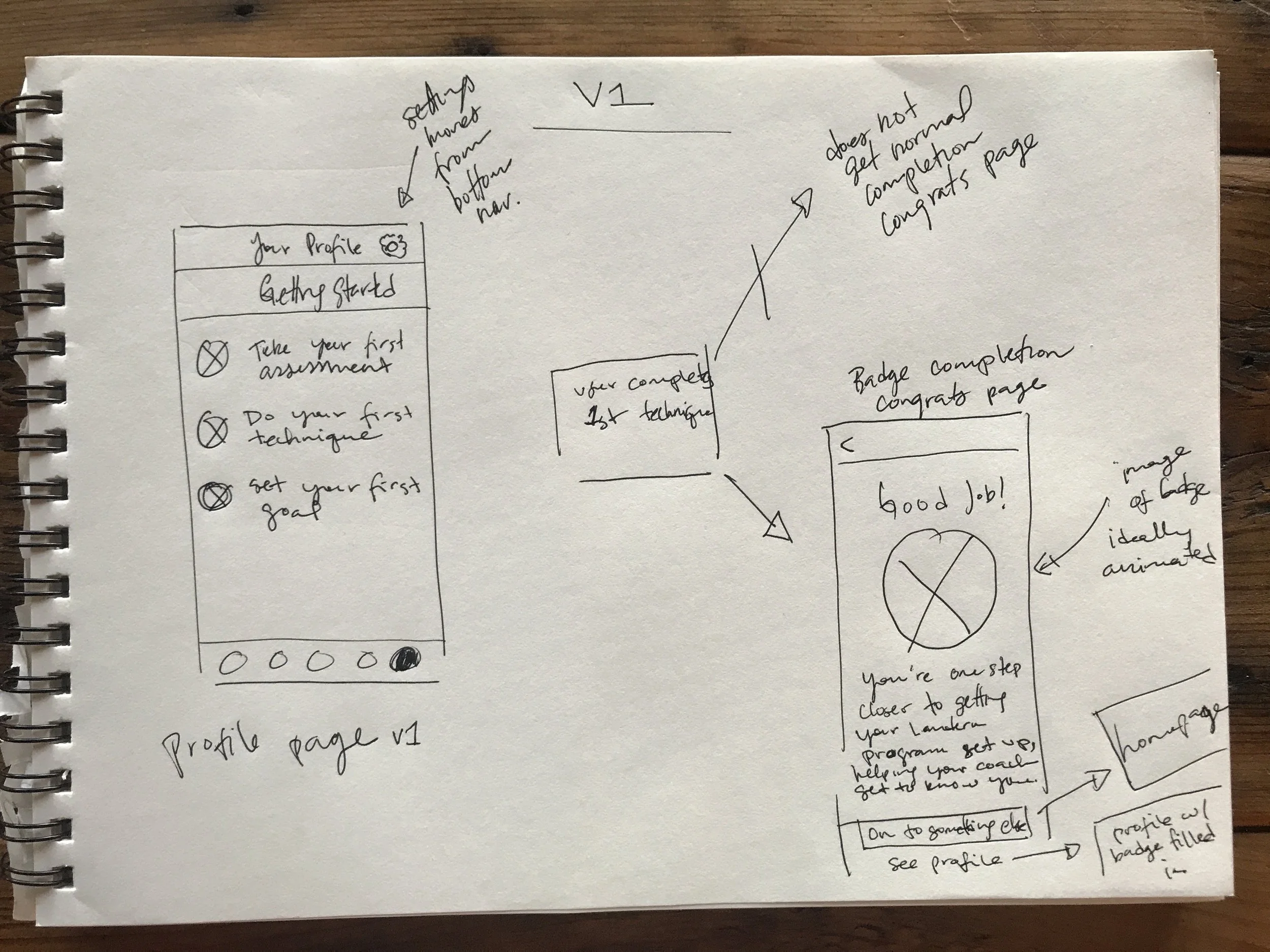
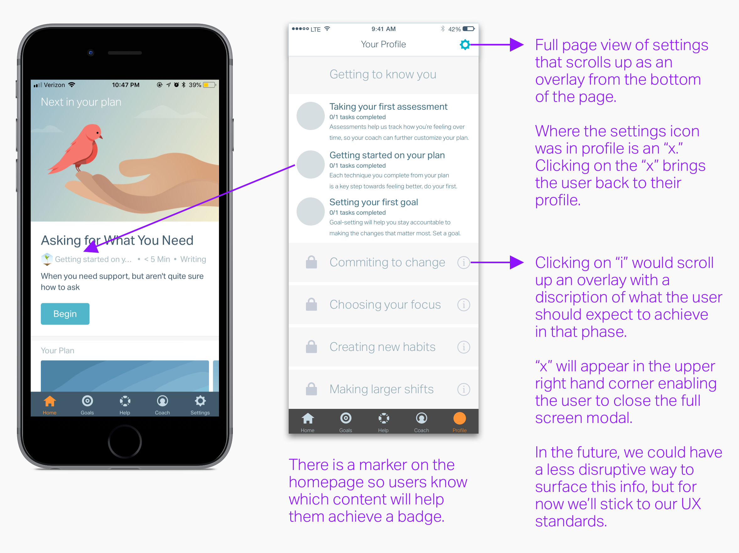
Wireframes
We decided to nest the progress page within a new profile tab bar item. This enabled us to add settings to the page. In the future, we were hoping to add other metrics, e.g. the user's GAD7 (a standardized measure for Generalized Anxiety Disorder) scores, to this tab.
The congratulations page and progress page v1 wireframes without final copy.
The v2 wireframes, with all progress levels without final copy or congratulations page.
Visual design
My design partner alead the visual design while I assisted with concepting.
Left: Congratulations visual, copy and badge icon changed depending on the badge the user has earned. Right: Profile section visual design.
The badge visual designs used a growth metaphor–as the user progressed through each level, they should feel like they were growing. Each icon corresponded with a level of progress.
Badge visual designs where all badges in the same level are represented by the same icon.
Outcomes
What changed
Our analytics team found that as opposed to the new homepage design without this progress feature where only 50% of users came back for a 3rd session, with this progress feature, 64% of users came back for a 3rd session. When comparing to the 3rd session return data for the linear homepage designs where only 60% of users came back for a third session, this new designs still came out on top.
Reflections
This project was rich with learnings, largely about process and collaboration. Prior to and during this design process, our coaching team did not have strong representation within the product organization. In the six months leading up to this project, we made several product changes that deeply integrated Lantern's coaching service with Lantern's content-based programs. As a result, any change we made to the product had a large impact on the coaching process.
Process for improved Coach and Product Team collaboration on feature changes
During the progress feature design, coaching was not consulted as fully as was necessary to allow them to make the process changes necessary to integrate this feature into their workflow. I began to address this collaboration issue by developing a process for better product and coaching collaboration.
This process was implemented with subsequent features, greatly increasing cross-team collaboration and allowing for more frictionless feature release.